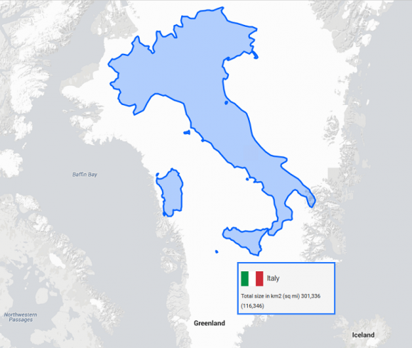
As we grew up and went through the various stages of school, we were all exposed to many maps, globes, and atlases. When we got older, we found out that maps are not exactly all that accurate. How inaccurate are they? I think you might be surprised to see the truth and some of you may even be shocked. What I saw was a definitely eye opening.
The True Size website gives you a map of the entire world with all of the borders for each country including disputed borders. The website wants to show you how big certain places really are. Once you go to their website, you will find a search box at the top where you are able to type in what country you would like to compare. Once you have entered the country, it will be highlighted and outlined on the map. It will tell you the the size in square kilometers and square miles. But the best part is, you can move the highlighted country of your choice around the map and place it over or next to other places to see the true comparison.

You can search multiple countries and move them around to see their true sizes. As you move a country around on the map, you will notice size of the country changing depending on which region and hemisphere its in. A good example I found was the comparison between Greenland/Brazil and Greenland/Italy. On the map, Greenland looks massive but in reality Brazil is far much bigger. Go ahead and compare the two countries on the True Size website.
Maps are pretty distorted and the True Size website makes changes for that distortion. No matter which country you choose and where you move it on the map, it will remain true to size. Check it out and play around with you. It’s a great learning experience. For the United States, you can even type in the 50 States and compare their sizes to other countries.
