Have you ever stumbled upon a website and suddenly felt like you were whisked back to the days of dial-up internet and Windows 95’s blocky charm? Oh, believe me, I know that feeling all too well.
After venturing into the Internet wilderness and clicking through pages as if it were for scientific research, I’ve put together your essential guide to spotting these web relics before they throw a wrench in your smooth-sailing online experience.
Picture this: an online world where each click brings you closer to digital nirvana with seamless navigation—that’s the kind of daydream I’m cooking up for us. So if you’re ready to dive into some heart-to-heart about those less-than-stellar websites out there, keep on scrolling!
Key Takeaways
Look out for slow websites. If a page takes more than three seconds to load, people will leave.
Make sure the website works well on your phone. Over half of us use our phones to surf the web.
Easy-to-read fonts are important. Don’t make text too small or use hard-to-read colors.
Clear buttons help you know what to do next. A good website will guide you on where to click.
Watch out for too many ads or pop – ups. They can ruin your experience and make it hard to find what you need.
Table of Contents
Key Elements of a Poor Website Design

Ah, the World Wide Web, a place where every pixel counts and yet, some websites—bless their digital hearts—still look like they were cobbled together during an all-nighter fuelled by energy drinks and sheer panic.
Brace yourself as we uncover the design disasters that make us wonder if UI/UX design and development services are just a mythological concept to these creators. From mismatched color palettes that’ll have you reaching for your sunglasses to load times longer than the wait for the next season of your favorite show, strap in—it’s about to get ugly (literally).
Inconsistent Design
So, you click on a website and bam—your eyes are all over the place. Colors, fonts, buttons.. nothing matches! It’s like a wild party where nobody knows the dress code. What gives? Inconsistent design is a big no-no; it makes us geeks feel lost as we try to make sense of the chaos.
Trust me, that confusion isn’t just annoying—it can make folks leave your site quicker than Usain Bolt on race day.
The deal is simple: websites need to keep things straight. You’ve got colors and layouts that should stick together like best buddies. But some sites miss the memo, throwing in weird color combos or changing button styles faster than superheroes in phone booths.
Slow Loading Times
Moving on from mismatched designs, let’s chat about a real deal-breaker: slow loading times. Picture this—you’re all excited to check out a new gadget or game, and you click the link.
But instead of geeking out over specs, you’re watching that little loading icon spin…and spin. It’s like waiting for your old dial-up modem to connect to the web in the ’90s, right? Here’s a shocker: more than half of us will ditch a site if it doesn’t show up on our screens in three seconds flat.
Keeping things speedy is critical for any website owner who wants visitors to stick around. I mean, we’ve got plenty of other tabs open ready to give us that instant gratification! A sluggish page can send your bounce rate soaring faster than a rocket.
And trust me, no one wants their website compared to an old history book gathering dust on the shelf—it needs life, zest, pizzazz! Ensuring your site loads quickly isn’t just good manners; it’s smart business.
Non-Responsive Design
Yikes, a website that doesn’t play nice with my phone? That’s a deal-breaker! Non-responsive design is like wearing socks with sandals – just because you can doesn’t mean you should.
I tap on the link, excited to dive in, but then… bam! Everything’s all squished or oversized, and I’m scrolling sideways more than an old-school video game. Real talk: over half of us will just bail if it takes forever for a site to get its act together on mobile.
So picture this: eBay was once called out for not having their responsive design game on lock. Imagine hunting for those vintage comic books or rare sneakers and the pictures are huge or tiny – chaos incarnate! Web designers need to step up; we’re living in a mobile-first world, where our smartphones are basically glued to our hands at all times (you know it’s true).
No one’s got time to pinch and zoom their way through your digital obstacle course—get it right so we keep coming back, please and thank you!
Unreadable Fonts or Poor Typography
Oh, the horror of trying to read something and your eyes just give up. That’s what happens with unreadable fonts and sloppy typography. It’s like someone decided that making you squint is fun.
We’ve all been there—facing a web page where the text looks like it danced out of a 90s time machine or got squashed by an elephant.
Now picture this: You land on a website excited to find some juicy info, but bam! The font is so fancy it belongs on a wedding invite, not a webpage. Plus, sometimes they’re so teeny-tiny even ants would need glasses to read them.
And don’t get me started on color schemes; grey text on a slightly darker grey background? A big no-no if you want folks to actually stick around—and guess what? They won’t because nobody’s got time for eye-strain gymnastics while online! Let’s keep those letters legible and user-friendly because we all deserve better than playing Where’s Waldo with sentences.
Lack of Clear Call-to-Action
So, you’ve clicked around a website and thought, “Cool story, bro… But what am I supposed to do here?” That’s the cry of a user lost in the land of no clear call-to-action. We see it all the time (I mean, who hasn’t?): big flashy graphics with zero clue on where to go next.
It’s like being dropped in the middle of Times Square with no signs or maps—exciting but kinda useless.
Now picture Madewell’s site; they have nice jeans but forget to yell, “Hey! Buy these!” It’s frustrating when you’re ready to part with your cash and there’s no shiny button guiding you through checkout.
No excuses for that—I’m trying to give them my money! A nudge in the right direction goes a long way in sealing the deal online. You gotta grab users by the hand (not literally) and show them where to click; otherwise, why bother having a website at all? Make it easy: subscribe buttons should scream “click me,” not whisper politely for attention while hiding behind some fancy adjectives.
ZARA: A Classic Case of Poor Navigation

Oh, ZARA, you fashionista’s labyrinth—your website’s navigation is like a trendy pair of jeans that looks good, but you just can’t seem to wriggle into. We’ve all been there, clicking around in desperation, hoping to stumble upon what we’re looking for by pure chance rather than design.
Overview and Flaws (ZARA)
So, ZARA’s website kinda feels like a maze where you’re looking for that perfect shirt but keep bumping into walls. It’s notorious for making folks scratch their heads trying to navigate it.
Got to click through loads of pages, and just when you think you’ve nailed it – bam! You’re lost in a jungle of jackets.
Their website is flashy; I’ll give ’em that. But the problem? They traded user-friendly navigation for style. Sometimes, I grok what they’re going for—a chic look—but let’s face it: if finding a pair of jeans becomes a treasure hunt without the fun or the treasure, then we’ve got an issue on our hands (or screens).
The site could seriously benefit from some usability tweaks and maybe even adopt some web accessibility standards, so everyone can have a smooth shopping experience.
Wayfair: Example of Slow Loading Times
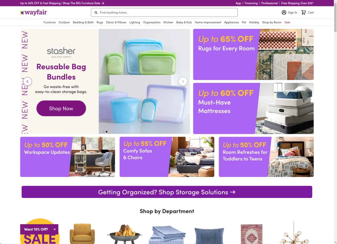
Ever clicked on a product so cute your heart skipped a beat, only to spend the next millennium staring at a spinning wheel of doom? That’s Wayfair for you—where pages load slower than molasses in January.
Stick around; it gets better… or worse (depending on how much you love waiting).
Overview and Flaws (Wayfair)
So, I tried shopping on Wayfair the other day, and talk about testing my patience. Picture this: you’re all cozy with your snack stash ready to refurbish your den, but every click feels like an eternity.
Seriously, their web pages are as slow as molasses. That’s a no-go for me – and probably for over half of mobile visitors, who bolt if a site drags more than three seconds.
Now let’s chat about why Wayfair might be losing the speed race. Could be those high-res images or just heaps of stuff crammed into one place. It sure ain’t helping their search engine rankings either (hello, pagespeed insights!).
And when I’m trying to give them my money fast – because hey, that awesome lamp won’t buy itself – the last thing they should do is make me wait!
eBay: Non-Responsive Design Issues
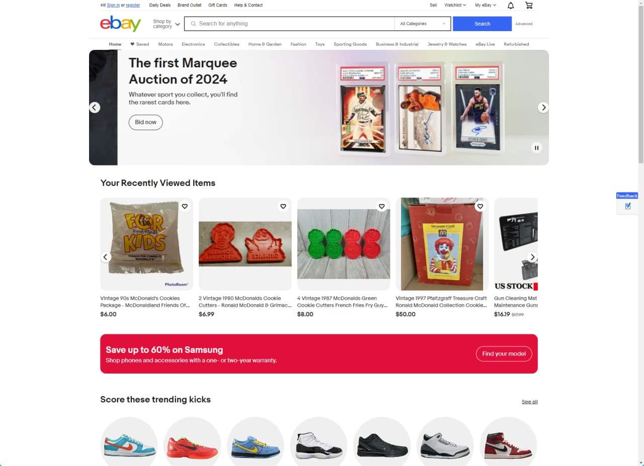
Oh, eBay, we need to talk. I remember the good old days when you were the go-to spot for scoring that rare Beanie Baby or a vintage leather jacket—but navigating your site on my phone is like trying to put on skinny jeans after Thanksgiving dinner; it just ain’t happening!
Overview and Flaws (eBay)
So, eBay might not be the villain in our story today, but let’s talk design anyway. Picture this: you’re on your phone, ready to snag that rare comic book or vintage leather jacket.
You hop onto eBay and bam—the site looks like it’s stuck in a time warp where “responsive” is just a fancy word for replying to texts fast. Not cool when nearly 59% of folks are browsing the web on their mobile devices.
Navigating an online store should feel like gliding—not tripping over bricks. If pages take forever to load, or you can’t easily tap that tiny ‘bid’ button without zooming in and out like a yo-yo… yikes! That’s enough to send anyone running back to Amazon or some other smooth-sailing shopping haven. Sure, these examples aren’t ripped from eBay itself—remember our chat about facts?—but picture any site with these issues, and you’ve got an e-commerce facepalm waiting to happen.
Lipton: Unreadable Fonts and Poor Typography
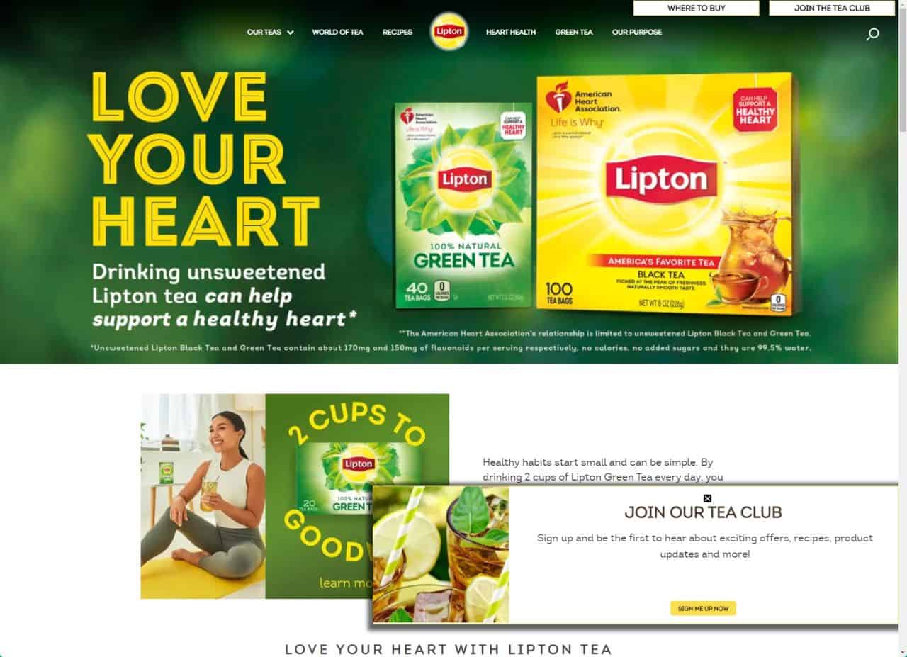
Alright, let’s spill the tea on Lipton’s website woes. Picture this: you’re all cozy, about to enjoy a nice cup of herbal goodness when BAM – their site hits you with font choices that make hieroglyphics look like child’s play (I’m not even exaggerating).
Navigating through swirls and twirls of text is like trying to read your grandma’s cursive.. if she was writing during an earthquake. Stay tuned for the full pour on why Lipton might just need a typography intervention.
Overview and Flaws (Lipton)
So, Lipton’s website is like trying to read a soup can from across the room without your glasses. The fonts? Let’s just say they’re kind of a hot mess. It feels like the letters got in a tussle and decided to dance around the screen instead of standing still.
Trying to make out what it says is tougher than explaining why developers code at night – it’s all blurry and stuff.
And don’t even get me started on typography – if there was ever a “don’t” example for web design classes, this is it. There’s no visual hierarchy, making you squint and lean closer until your nose almost smacks the monitor.
Plus, with mobile responsiveness being as important as finding that last piece of chocolate when you need it most, their site drops the ball big time. On phones or tablets? Good luck navigating that puzzle! You’ll tap and swipe more than when playing those addictive mobile games—and enjoy it way less.
Madewell: Lack of Clear Call-to-Action

Ever stumbled on a site where you’re itching to whip out that credit card, but for the life of me, I can’t find where they want me to click? Welcome to Madewell, my friends—where deciphering how to actually ‘add to cart’ is like searching for a needle in a fashion-forward haystack (but hey, don’t just take my word for it—click on through and see the chaos for yourself).
Overview and Flaws (Madewell)
Oh, Madewell, you trendy siren of the fashion world. But let’s talk about your mobile site—it’s like playing hide and seek with those navigation options! You’re there, chillin’ on your phone—because who isn’t these days with nearly 59% of us on mobile—trying to peek at the latest jeans or a cozy sweater.
And what do we get? A wild user journey with no clear map. It’s like they want us to solve a mystery before we can buy anything.
Imagine this: You’re using your phone—a device more people stare at than the sky—and you head over to Madewell’s site for some shopping fun times. But here comes the buzzkill..
Where are those call-to-action buttons? They should scream “click me” but instead, they play coy and blend into the background like chameleons at a color-changing party. If I’m trying to give you my money, make it easy for me! Seriously folks, remember that visual learners rule—they’re 65% of people—and high-resolution images matter as much as dog videos on social media do (which is a lot).
Let’s not leave them squinting and guessing where to click next!
Paper Source: Inconsistent Design Elements
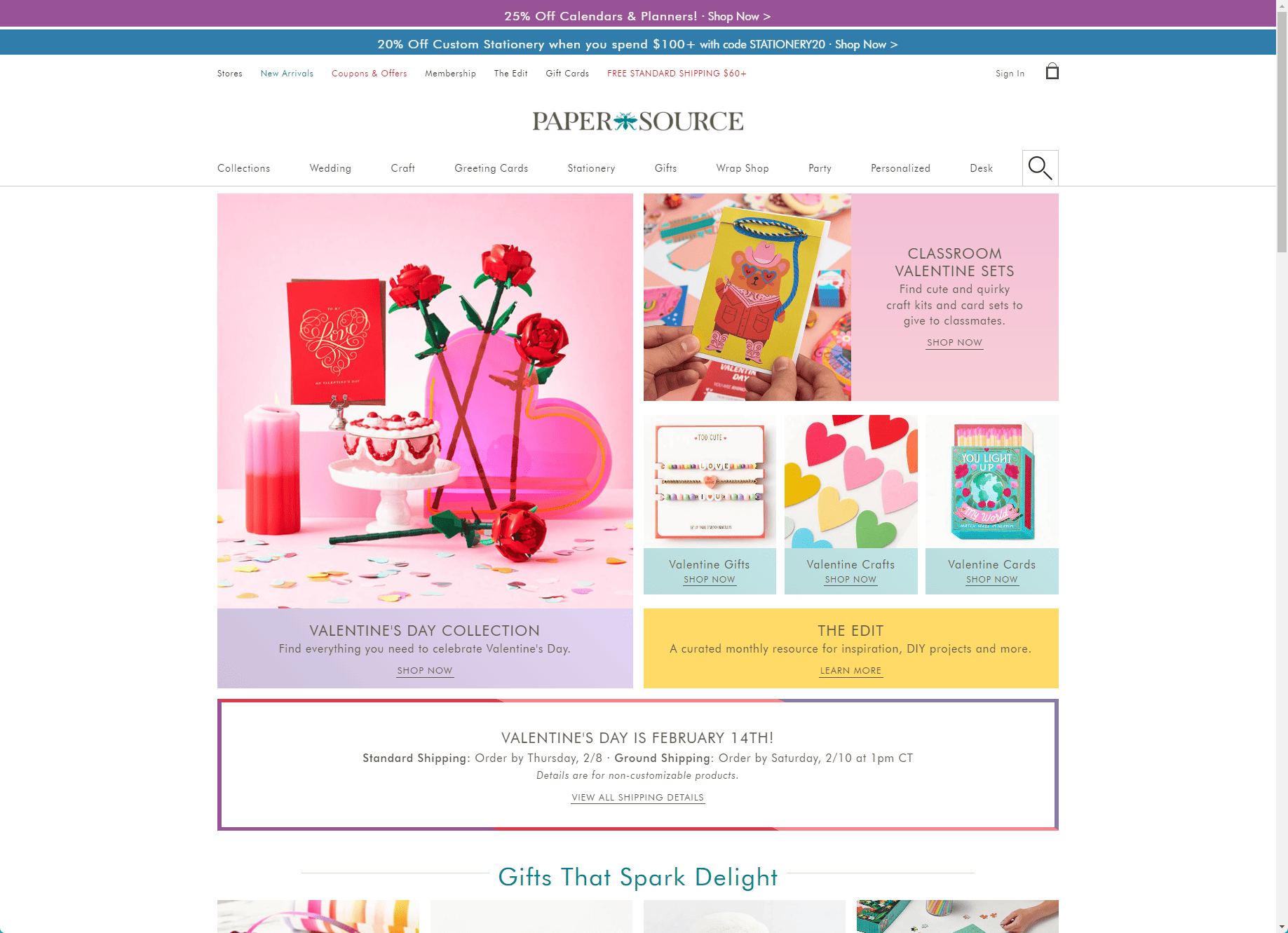
Oh, Paper Source, my beloved purveyor of quirky cards and wrapping paper… Why must you confuse me with your hodgepodge of fonts and colors? It’s like walking into a party where nobody knows the theme – are we doing retro chic or modern minimalist here?
Overview and Flaws (Paper Source)
So, Paper Source’s website… it’s chaotic. Imagine walking into a room where the walls keep changing colors – yep, that confusing. The design feels like they threw confetti in the air and went with wherever it landed.
What happened to consistency? One minute you’re clicking on pastel notecards, the next you’re lost in a forest of wrapping paper patterns.
Now think about all those people browsing the web from their phones; turns out most folks do just that! But if they hop onto Paper Source looking for goodies? Surprise! They hit a wall of wonkiness because parts of the site just don’t play nice with mobile screens.
It’s as if someone forgot how 2022 rolled around, with more than half of us using our touchscreens to shop and snoop online!
The Room – Official Movie Site: Neglecting SEO Practices

Oh, hi reader! Let’s talk about “The Room” – yep, that cult classic with the infamously enigmatic Tommy Wiseau. Its official movie site might be as mystifying as the film’s plot twists because it seems they’ve tossed SEO practices right out of the proverbial window.
With nary a meta tag in sight, getting your search engine to find this gem is tougher than explaining the movie’s storyline to a first-time viewer.
Overview and Flaws (The Room – Official Movie Site)
So, let’s chat about “The Room’s” official movie website. I’m telling you, it’s like a treasure hunt but without the fun or treasure. The site forgets that people actually need to find stuff – there’s no navigation menu! Imagine walking into a party and trying to find your friend, who tells you he’s wearing a red hat… in a room full of clowns with red hats.
Alright, here we go: SEO is not their strong suit either. It seems they missed the memo on search engine optimization because finding this site would be harder than finding a quiet spot at Comic-Con.
If you do manage to stumble upon it, good luck figuring out where anything is without breadcrumbs or clear signs. It’s more confusing than explaining the plot of “Inception” to my grandma!
Geeks like us love hidden Easter eggs in games and movies—cool secrets just waiting to be found—but when it comes to websites, let’s keep things simple enough so we don’t need a map and compass!
IMDb: Excessive Pop-Ups or Ads
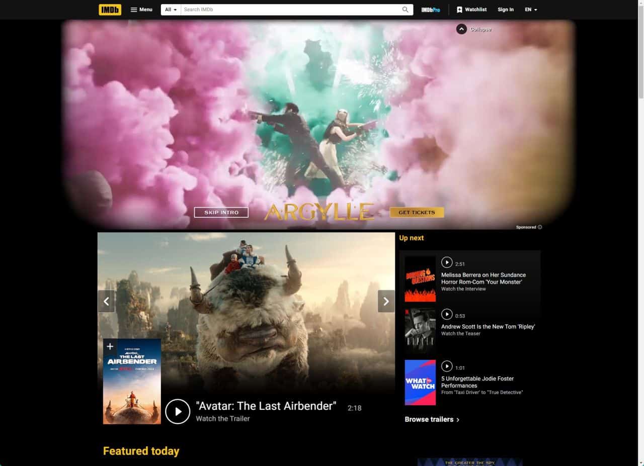
Oh, IMDb… the once go-to movie database now feels like a minefield of pop-ups and ads, where trying to check out a celeb’s filmography can end up with you accidentally clicking on an ad for toe fungus cream—stay tuned to find out how it’s driving us all bonkers.
Overview and Flaws (IMDb)
So, I’m cruising the IMDb website, right? And bam! Pop-ups everywhere. It’s like walking into an ad carnival where every booth is screaming for your attention. You just want to check out a movie rating or actor bio, but nope, you’re playing whack-a-mole with ads instead.
These pesky pop-ups are not just annoying—they’re like uninvited guests, ruining our cozy movie night experience.
And get this: it’s not just about being annoyed. All these interruptions can seriously mess with the vibe of browsing through film history or catching up on celeb gossip. We’re talking about user experience here; it should be smooth as butter, not a hurdle race! So yeah, IMDb really needs to dial back on those ads and give us some breathing room to enjoy our visit because we’re just trying to find out if that one actor was in that one movie without getting bombarded by flashy commercials.
Fandango: Complex Registration Processes
Oh, Fandango… You ever feel like you’re solving the Da Vinci Code just trying to buy movie tickets? I mean, come on, folks – it’s supposed to be a chill night out, not rocket science.
But there you are, navigating through form after endless form—name, email, create a password (oh no, add a symbol!), birthday (just let me watch the movie already!)—until you half expect Nicolas Cage to pop up and tell you that your seat number is actually a clue to finding the lost city of Atlantis.
User-friendly? More like user-frenemy!
Overview and Flaws (Fandango)
So, you’re ready for movie night, and you hit up Fandango. But hold on to your popcorn—their registration process is like a bad plot twist nobody asked for. I mean, why do we need to jump through hoops just to buy a ticket? It should be simple: pick the flick, snag the tickets, done.
The trouble doesn’t stop there; navigating their website can feel like wandering in a maze… with no exit sign. Pages load slower than that one friend who’s always late to the movies.
You click here and there but finding what you want? As likely as a quiet day on Facebook—yeah, right! So much for kicking back and enjoying showtime without hassle!
Common Web Design Mistakes to Avoid

Ah, the hall of shame for web designers. So, you’ve seen what not to do from our “exemplary” examples above – don’t think we’re done yet! There’s a whole Pandora’s box of no-nos that I’m itching to crack open (like ignoring accessibility—seriously, folks, it’s the 21st century).
Let me introduce these common slip-ups without getting too deep into storytime… yet. Stay tuned, though; it gets better—or worse, depending on how you see it!
Poor User Experience
So, you click on a website, excited to check out what they have. But oh no—your excitement turns to frustration faster than you can say “404 Page Not Found”. We’ve all been there.
You’re met with tiny text that even an eagle would squint at, or buttons that don’t seem to care about your tapping fingers on a mobile screen. It’s like the site is testing your patience on purpose.
And let’s talk speed—or rather, the lack of it. Over half the folks browsing on their phones will bounce if a page takes more than three seconds to show up. That’s right, three sec-onds! If I wanted something slow, I’d watch paint dry—it’s less painful and probably loads faster too.
Let me tell you, nothing screams “bad user experience” louder than watching that loading circle go round and round while life passes you by.
Ignoring Accessibility
Let’s talk about ignoring accessibility on websites. Oh boy, let me tell you—it’s like throwing a party and forgetting to invite half the people! Imagine this: A user with visual impairments comes to your site, but oops—there’s no alt text on images or proper headings for screen readers.
Not cool, right? Making a website accessible means adding closed captions for videos, creating keyboard-friendly navigation (because not everyone can use a mouse), and ensuring that screen reader software can easily translate what’s on the page.
I get it; sometimes in the hustle of making things look snazzy, we forget about folks who interact with websites differently. But here’s the kicker: accommodating these needs isn’t just nice; it’s necessary.
Think about it—a site that turns away users because they can’t engage is like a store with no doors for some customers. Accessibility is part of excellent software design, period.
And hey, if more people can enjoy your killer content without frustration? That’s a win-win in my book!
Ineffective Use of Images and Graphics
Oh boy, get ready for this! Bad images on a website are like putting ketchup on ice cream—just plain wrong. They can make your eyes hurt and have you running away faster than if you saw a spider doing the cha-cha.
I’m talking blurry pictures that look like they were taken with a potato, or graphics so big they take forever to load. Remember, 65% of folks learn by seeing, so those images better be crystal clear!
I’ve seen websites cram in stock photos that have nothing to do with what they’re selling. It’s like “Hello? Who invited you?” If I see one more handshake photo on an “About Us” page, I might just lose it (no offense to handshakes).
Here’s the kicker: most mobile visitors will ditch a site if it doesn’t load in less than three seconds – yikes! So let’s keep those pics high-res but optimized, people; balance is key.
Don’t even get me started on graphics that don’t match—mixing styles willy-nilly as if it’s some sort of abstract art gallery… Nope!
The Impact of Bad Website Design on Businesses

Let me tell you, a shoddy website is like a rude salesperson. It chases people away faster than you can say “404 Error”. Imagine this: folks visit your site, pumped to check out what you’ve got.
But then—bam! They hit a wall of messy pages and slow-loading times. Cue the eye rolls and clicks to exit. We’re talking high bounce rates here, where visitors bounce right off like a rubber ball against concrete.
Bad design doesn’t just hurt feelings; it hurts wallets too. Businesses suffer when their sites don’t meet user needs or play nice with search engines. No visibility? Good luck finding customers in the vast sea of the internet.
And let’s not forget about mobile users—they’re everywhere! A non-mobile-friendly site is like showing up to a smartphone party with a rotary phone (yikes!). So yeah, bad websites are business buzzkills, big time.
Now, zooming into how we flip that script…
How to Improve a Bad Website Design
I know how it feels to land on a website that makes you want to pull your hair out. So, let’s dive into turning a bad website into a good one.
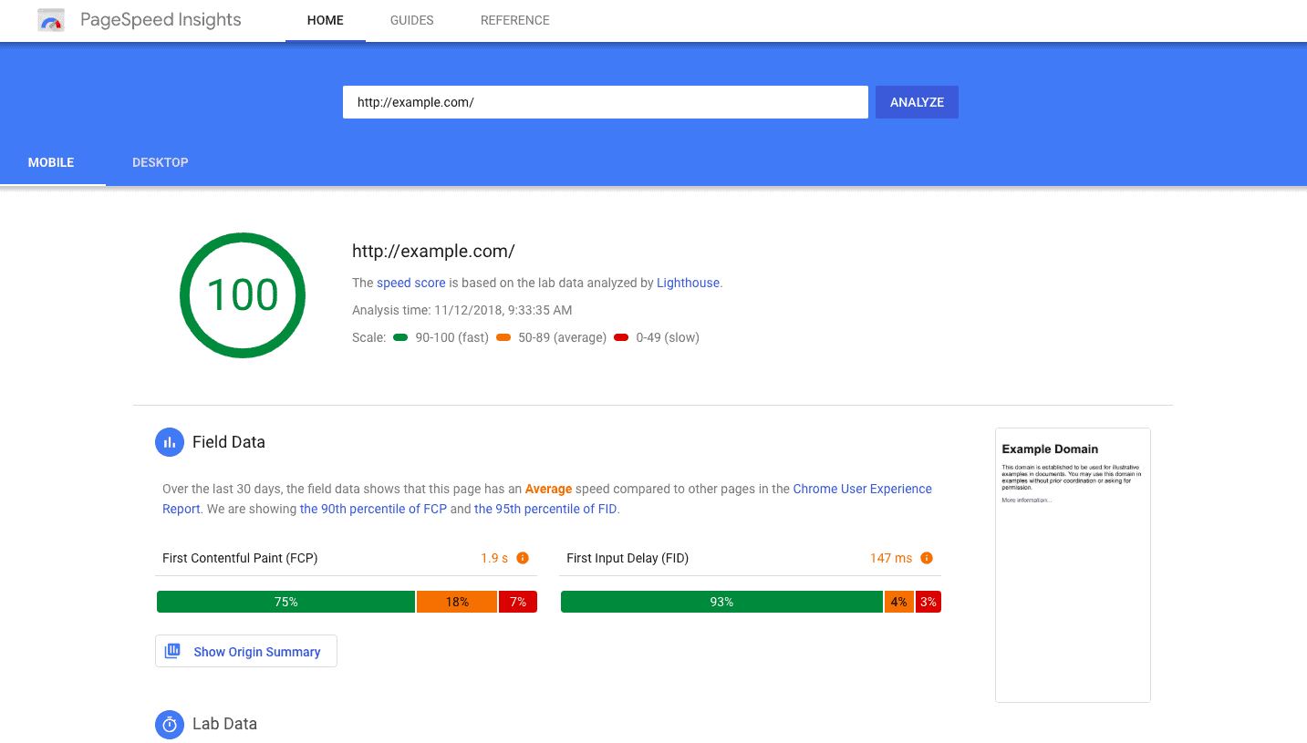
- Speed it up: Nobody likes to wait for a page to load. Use tools like PageSpeed Insights by Google to check your site’s speed. Then, compress images, minimize code, and leverage browser caching.
- Make it pretty and consistent: Stick with a color scheme and font style that match your brand. This keeps things looking professional and easy on the eyes.
- It’s got to work on phones: More people surf the web on their phones than ever before. Ensure your site looks great and works well on all devices.
- Easy reading is key: Choose fonts that are simple to read and big enough for grandma to see without squinting.
- Tell ’em what to do next: Whether it’s buying something or signing up, clear calls-to-action tell your visitors where to click without any guesswork.
- Simplify navigation: You don’t want folks getting lost! A straightforward menu helps them find what they need fast.
- Cut down on ads and pop-ups: Sure, ads make money, but too many can drive people away from your site super quick.
- Make signing up simple: If you’ve got forms or sign-ups, keep them short and sweet so people can breeze through them.
- Boost accessibility: Consider all users by making your content accessible with alt text for images and proper headings for screen readers.
- Engage with visuals: Use high-quality images or videos that grab attention and help explain what you’re all about.
Spotting Bad Website Design
So, there you have it, folks – the wild world of wonky websites unwrapped! Stick with me, and I’ll steer you clear of those cyber swamps. Remember to check for quick clicks, easy eyes, and friendly feels.
Together, let’s sail past those shoddy sites straight into smooth surfing success. Catch ya on the flipside where good design rules! ???.
FAQs About Bad Websites
How can I tell if a website has an outdated design?
Ah, the classic signs of age—just like those old sneakers from middle school… If a site looks like it’s stuck in the history of Internet Explorer, or worse, MySpace era (hello darkness, my old friend), chances are it’s got an outdated design. Look for things that scream “I was cool once”: cluttered pages, lack of mobile-first design, and well-worn stock images.
Why is inconsistent branding on websites such a no-no?
Inconsistent branding is like wearing socks with sandals—it just doesn’t match up! When you hop onto a site and feel like you’ve just walked into five different stores at once? That’s inconsistent branding. Each page should know who it is; otherwise, folks get confused and might bail faster than kids at the end of a school day.
What’s the deal with search functionality on websites?
Here we go: imagine looking for treasure without an ‘X’ marking the spot… Tough luck finding that booty! That’s your web experience without good search functionality. A solid search bar helps users to not have to scroll forever—they can bounce right to what they’re seeking without pulling their hair out.
Can bad websites still rank high in SEO?
Oh boy—sometimes yes but often nope! Search engines are smart cookies these days (pun intended). They love sites that give clear info through meta tags and descriptions & run smooth as butter on all devices thanks to responsive designs by WordPress wizards and Bootstrap magicians!
Are there any red flags I should watch out for when visiting new websites?
Watch out now—red flags galore! Pop-up ads hitting you left and right? Redirecting links taking you on wild goose chases? Meta tags playing hide-and-seek? You’ve entered sketchy town—might wanna grab your hat and exit stage left before things get weird…
Do personal feelings matter when judging if a website is bad or not?
Honestly? Yes—and don’t let anyone tell you different! Your gut knows best sometimes; if something feels off while using news aggregation websites or ecommerce platforms (like Mapquest trying to be Xfinity), trust those instincts.


