Curiosity strikes when we see the bitten apple logo on our gadgets, doesn’t it? After all, I’ve often wondered why such a simple image represents one of the world’s most influential companies.
Tidbit for you: did you know that this iconic logo was designed by Rob Janoff and has remained largely unchanged since its creation in 1977? In this detailed exploration, we’ll dive into the fascinating evolution of Apple’s logo and unpack each transformation it has undergone over the years.
Let’s get started to find out what lies behind that famous crunch!
Key Takeaways
The Apple logo has undergone several transformations since its creation in 1977, starting with a detailed image of Isaac Newton and eventually transitioning to the now-iconic bitten apple design.
The bite taken out of the apple represents human curiosity and a thirst for knowledge while also symbolizing a byte of digital information and highlighting Apple’s involvement in technology.
The simplicity and minimalist design of the Apple logo have contributed to its effectiveness in building brand recognition, making it one of the most iconic logos in history.
Table of Contents
The Origins of the Apple Brand
Apple was established on April 1, 1976, by Steve Jobs and Steve Wozniak in Cupertino, California.
When was Apple established?
Let’s hop onto our time machine and journey back to the year 1976. That was when three ambitious and ingenious men – Steve Jobs, Steve Wozniak, and Ronald Wayne – laid the foundation of what we now know as Apple Inc., one of the world’s most influential companies.
Now soak in that nostalgia!
How did Apple get its name?
Here’s a bit of tech trivia for you. Apple Inc.’s name was inspired by the memory of a happy summer Steve Jobs had spent in an apple orchard in Oregon. Now, I’m not saying that’s where he bumped into Newton or anything – that would be quite the time-travel story! Instead, after spending some time working on an apple farm, our man Steve decided to call his new technology venture ‘Apple’.
A fan of the fruitarian diet, he believed it sounded “fun, spirited and not intimidating,” which was precisely what they wanted for their brand image. However, this naming decision almost got them in hot water with The Beatles’ company Apple Corps Ltd., but let’s save that juicy tale for another day! So there you have it, folks – how your beloved iPhone and iPad got their fruity heritage.
The Evolution of the Apple Logo
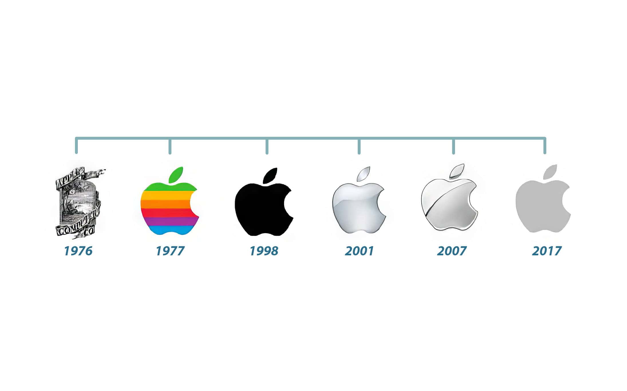
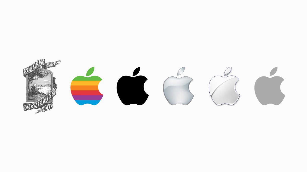
The evolution of the Apple logo began in 1976 with the first Apple logo, which featured a detailed image of Isaac Newton sitting under an apple tree.
The first Apple Logo (1976 – 1977)

Back in 1976, there was an entirely different vibe to the Apple logo that we know today. Picture a classical scene with Isaac Newton under an apple tree – book in hand, and about to discover gravity.
The vision for this initial image, encased within a smooth ribbon declaring “Apple Computer Co,” came alive. Believe it or not, this ornate emblem laid the foundation of what was going to be one helluva technological ride!
Transformation of the logo (1977 – 1998)
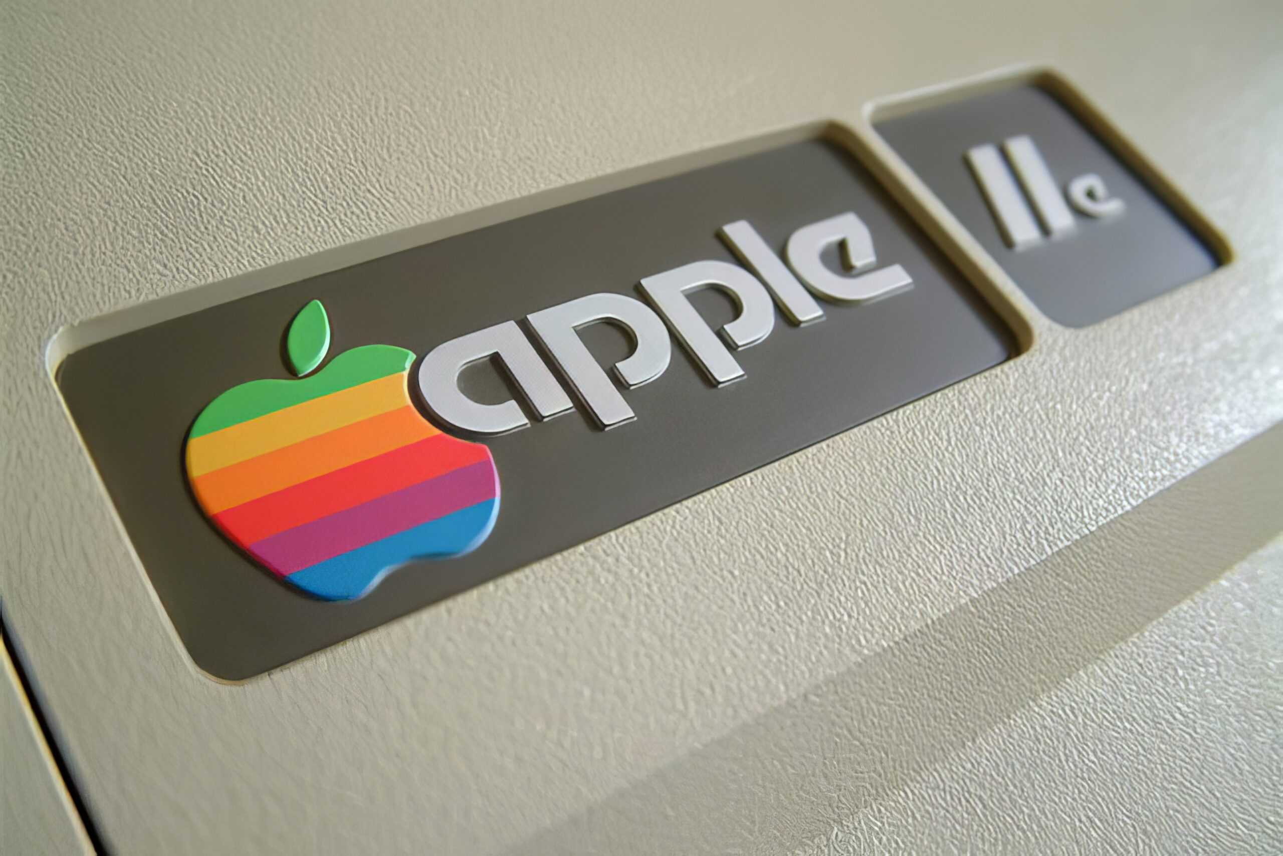
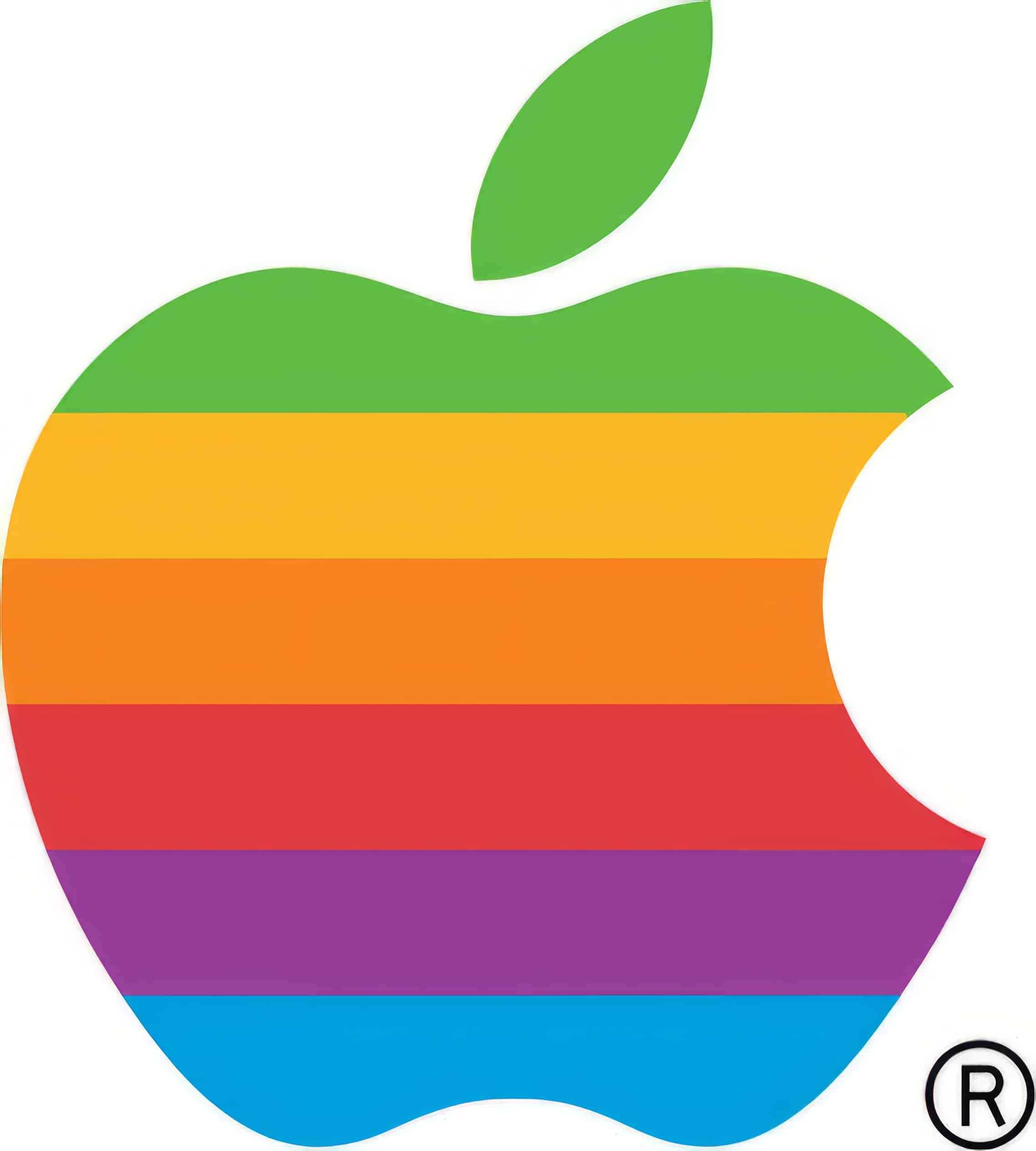
During the transformation of the Apple logo between 1977 and 1998, several changes were made to its design. The iconic bitten apple logo, designed by Rob Janoff in 1977, became one of the most recognizable visual identities in history.
It featured a rainbow pattern representing diversity and creativity. However, in 1998, as part of a rebranding effort, the logo was simplified and replaced with a monochromatic version that we still see today.
This change reflected Apple’s transition towards a more minimalistic design approach and solidified its reputation as a brand synonymous with sleek sophistication.
The modern Apple logo (1998 – Today)
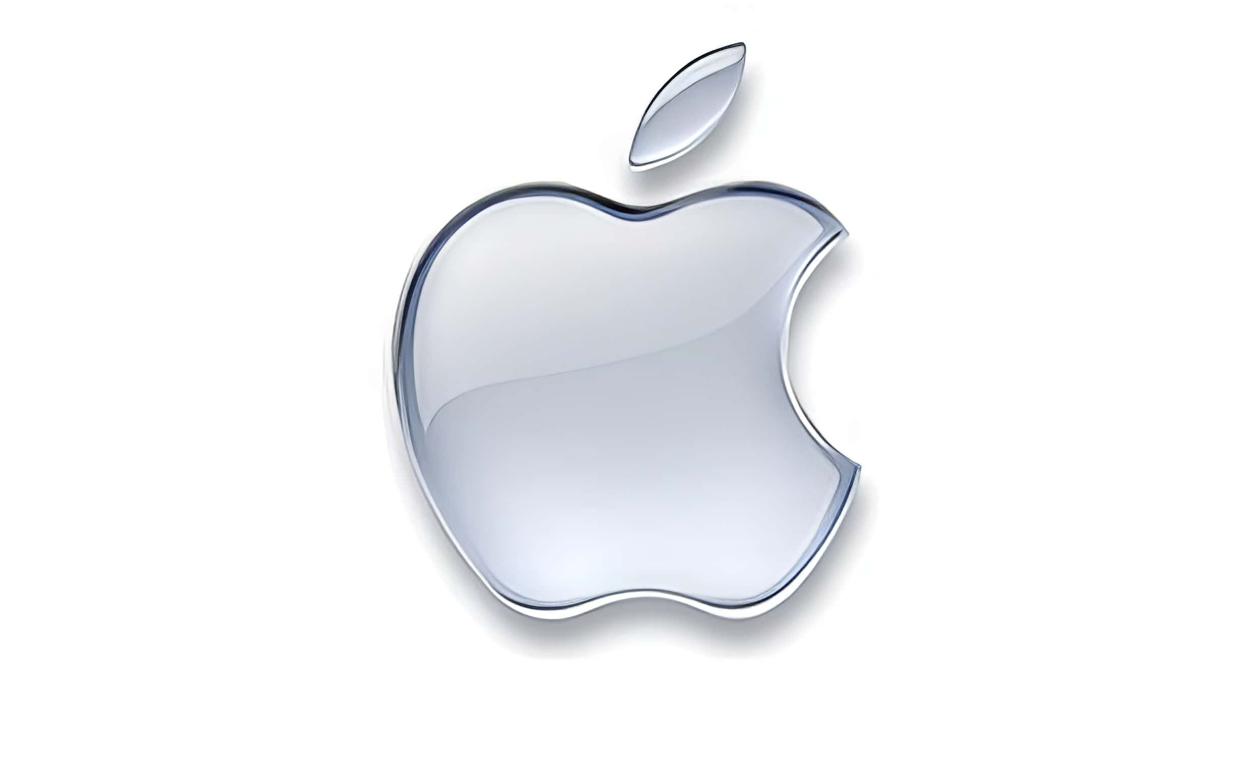
The modern Apple logo, which has been in use since 1998, is instantly recognizable to geeks and consumers alike. It features a sleek and minimalistic design of a bitten apple, symbolizing human curiosity and our constant thirst for knowledge.
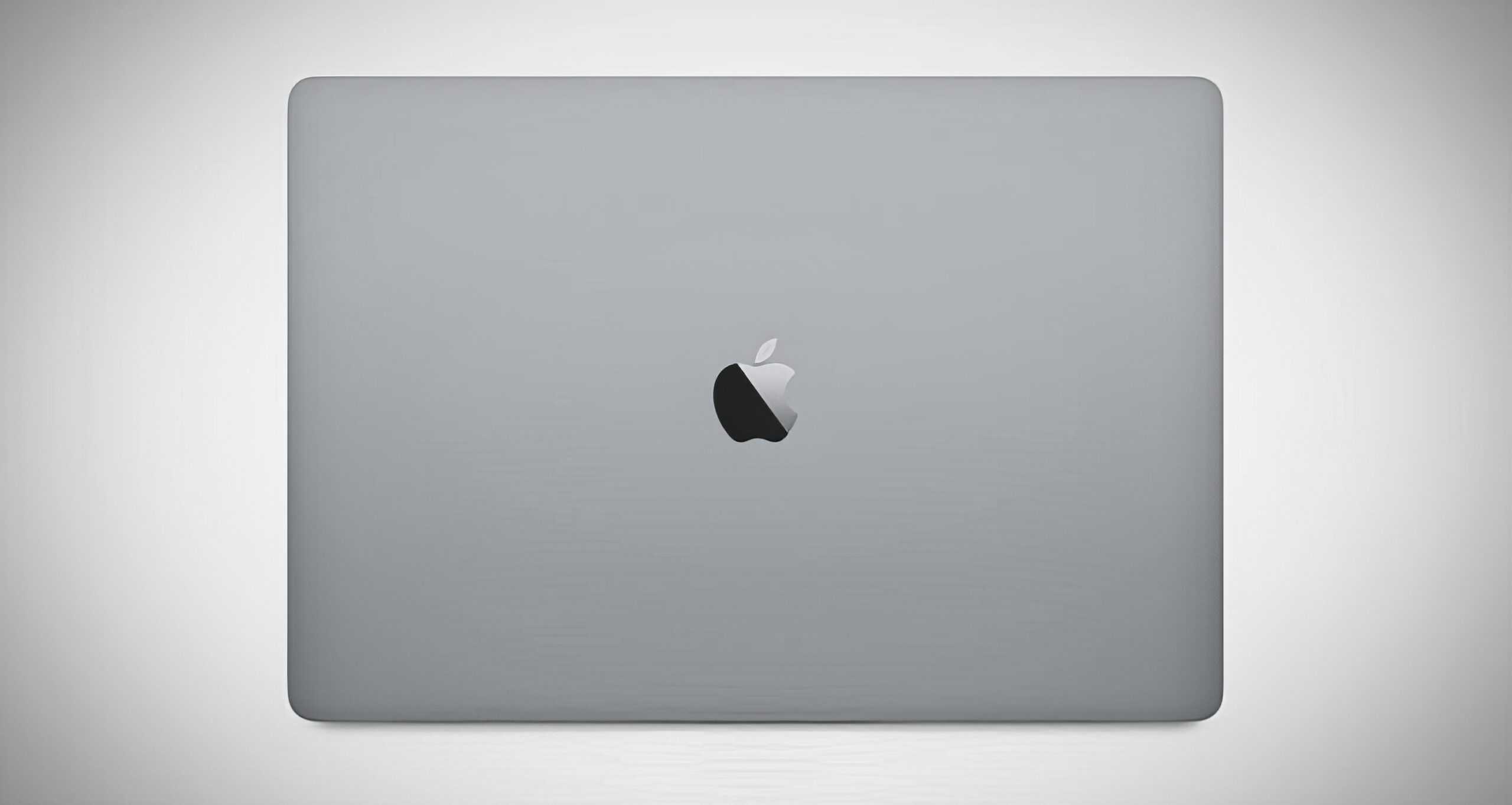
The logo’s shape and colors have remained relatively unchanged over the years, solidifying its position as a timeless emblem of style, technology, and excellence. Whether it’s on an iPhone, iPad, or any other Apple device, this iconic logo represents the brand’s commitment to innovative design and user-friendly experiences.
Interpretation and Symbolism of the Apple Logo
The Apple logo is filled with interpretation and symbolism, from its shape to its colors.
Meaning behind the bitten apple
The bitten apple in the Apple logo holds both historical and symbolic significance. The “bite” taken out of the apple represents our human curiosity and desire for knowledge, harkening back to the story of Adam and Eve in the Garden of Eden.
It symbolizes a thirst for innovation and exploration, which are at the core of Apple’s brand identity. Additionally, the bite also serves as a play on words, representing a byte (a unit of digital information) and highlighting Apple’s involvement in technology and computing.
So, next time you see that iconic bitten apple logo, remember that it represents not only style but also our innate human quest for knowledge.
Color and shape of the logo
The color and shape of the Apple logo play a significant role in its design. The logo features a simple, clean, and minimalist design with a recognizable bitten apple shape. The colors used in the logo have evolved over time, from the vibrant rainbow pattern of the original logo to more monochromatic versions.
The choice of colors is deliberate and strategic, as it allows the logo to stand out on different backgrounds and enhances brand recognition. Whether it’s the flat black on older devices or the glossy silver on modern ones, the Apple logo represents sleekness, innovation, and high-quality technology.
The Impact of the Apple Logo
The Apple logo has had a significant impact on the success and recognition of the brand, becoming one of the most iconic logos in history.
Effectiveness of the logo
The effectiveness of the Apple logo cannot be overstated. It has become one of the most iconic and recognizable logos in history, instantly associated with cutting-edge technology and innovative design.
The clean and minimalist design, featuring a bitten apple, is sleek and visually appealing. It stands out among other technology logos and creates a strong visual identity for Apple as a brand.
The logo’s simplicity also makes it easy to remember and recognize, contributing to its effectiveness in building brand recognition. Furthermore, the bite taken out of the apple adds an element of playfulness while symbolizing human curiosity and a thirst for knowledge.
Interesting facts about the Apple logo
Here are some fascinating facts about the Apple logo:
- The first Apple logo featured Sir Isaac Newton sitting under an apple tree, symbolizing discovery and inspiration.
- The rainbow-colored Apple logo was designed to represent the diversity of Apple’s products and appealed to the counterculture movement of the 1970s.
- The bite taken out of the apple logo was intended to differentiate it from a cherry or other fruits. It also represented a “byte” of digital data, connecting to Apple’s technology focus.
- Steve Jobs, co-founder of Apple, came up with the idea for the bitten apple logo as a way to prevent people from confusing it with a tomato.
- The original rainbow-colored logo was gradually phased out in 1998 when Apple introduced its stylish monochromatic logo, symbolizing simplicity and elegance.
- There have been various interpretations of the bitten apple symbol, including references to biblical stories like Adam and Eve in the Garden of Eden or the fruit of knowledge.
- The current sleek and minimalist design of the Apple logo has remained unchanged since 1998, reflecting Apple’s commitment to clean aesthetics and modern design principles.
- The colors used in the logo’s early iterations were inspired by those found in popular computer interfaces at the time, such as Macintosh Aqua-themed designs and glass-themed logos.
- While many logos evolve over time, the enduring popularity and recognition of the Apple logo have made it one of the most iconic corporate logos in history.
- The bitten apple emblem has become synonymous with cutting-edge technology, innovative design, user-friendly products, and high-quality craftsmanship that have come to define Apple Inc.
Frequently Asked Questions About the Apple Logo
How has the Apple logo evolved over time?
The Apple logo has undergone several changes since its original design in 1977. It started as a complex illustration featuring Sir Isaac Newton sitting under an apple tree, then transitioned to a rainbow-colored apple and eventually became the simple monochromatic silhouette we know today.
What is the meaning behind the Apple logo?
The meaning behind the Apple logo is often debated, but it is commonly associated with knowledge, creativity, and simplicity. Some speculate that the bite taken out of the apple represents a reference to Adam and Eve’s story from biblical mythology or as a nod to computer byte.
Why did Apple change their logo design?
Apple changed their logo design over time for various reasons. The initial complex design was deemed too intricate for reproduction on small products like computers and was simplified for better scalability and recognition purposes. The transition to a monochromatic silhouette aligned with Steve Jobs’ minimalist aesthetic vision for the company.
Is there any significance to the colors used in previous versions of the Apple logo?
The rainbow-colored version of the Apple logo had symbolism related to inclusivity, diversity, and innovation during its time. The vibrant colors represented different sections within technology at that period, such as red for education, orange for engineering, yellow for science, green for financial departments or markets, blue meant advertising/arts/design work, and violet referred to support staff. Overall – it symbolized an optimistic view about future development across all fields!
Conclusion
In conclusion, the evolution of the Apple logo tells a fascinating story of innovation and symbolism. From its humble beginnings with Isaac Newton to the iconic bitten apple we know today, the logo has become synonymous with style, technology, and quality.
Its meaning goes beyond aesthetics, representing human curiosity and our desire for knowledge. The Apple logo is not just a mark on a product; it’s an emblem that has made Apple one of the most influential companies in history.
